The premise of the project "Michaela" was to show that an average teenage girl can be an extraordinary weight lifter. It shows what she does and that her father is her coach. The project helps illustrate how the father and daughter relationship is altered when both are in the gym. It also shows how it brings the family together and makes Michaela (the lifter) happy.
The work is generally well put together from a design point of view. Most shots do use the rule of thirds and place the subject in the frame properly. Shots such as the one pictured on the left are accurate representations of well placed and filmed shots. This work has some very nice looking shots while others are a little too wide or too close for the shot to meet the standards of the shot it was to be. Shots such as the one below are much too close to be an accurate close up, for the interviewee's head is being cut off.
This project had a very interesting story about an unlikely heavy-weight lifter, a young woman. Her and her family are drawn closer together by her participation and her father's coaching. The story is told well with multiple representations of what people think about Michaela lifting and how it is affecting the community. Shots of the weights and her training as well as competing help to tell the story as well and do a wonderful job of this. The voice overs also help to bring more understanding to the minds of the viewers and help round out the creator's way of storytelling.
I learned many things from analyzing this piece of work. One of these things was that not every shot needs to be focused on the subject, sometimes the camera is focused on the weights. I will apply this to my works to add more depth to them. While I learned from this deep look into this work, I also found things that I had already learned. Much of the framing I saw I had already learned, which can be seen above.
The creator did many things well in within this short project. The project showed a definitive subject focus and kept the viewer entertained for the allotted time because of the way shots were continuously being played through behind audio. Much of this project was done well, sometimes though, framing was an issue. The reason framing shots wasn't done as well as it could have been was because some shots were hard to identify because the hips were shown but not the feet, leading the viewer to wonder if it was meant to be a medium or wide shot.
In the end, the project did the job it was created to do. It entertained the viewer and told the story of the subject accurately. While it could have been framed more properly, that did not take away from the story as much as bad audio could have been. I personally enjoyed the story involved and was intrigued by it.
Graphic design is a way of expression and communication through images and other graphics. It is a technological form of art. It is about making certain things display a message either via typography or visual effects. Graphics also help pass on feelings from the creator to the the viewer. Graphic design applies to everyone and everything. Nearly every product on the market has some sort of design on it, anything from cars to cracker boxes.
Graphic design connects with me by way of how I express myself and communicate my thoughts to others. I use music but sometimes it isn't enough to convey what I want. I prefer graphic design because it allows for me to write things and show specific messages that directly relate to something else. I also connect through representation. I like how graphic design allows for me to represent different countries, companies, people, and places. Graphic design is so free flowing and has many freedoms, there is truly no limit to how much you can do with graphic design. Everyone with a business or product needs a logo and I love that it allows for my creativity to flow.
When I was in the graphic design strand I was in charge of making the website banner. I knew I wanted one specific color, but I needed it to be interesting and dynamic. I began working on a radial gradient to give the banner a central point, after this development I wanted to add some contrast and a little bit of texture. So I browsed the internet and added a simple overlaid chevron. It helped add character to the banner. After adding our our company name, logo, and slogan I put a drop shadow on all of them in order to finish it up.
After completing my web banner, my group needed help on some text for the website. Our sidebar needed a reasonable amount of text and my group had asked me to do it. I wrote up a simple description of our company and website. I listed a few things that can be found on the website to give the customer an idea of what to look for on the site. I then passed the file on for revisions and editing before going on the website.
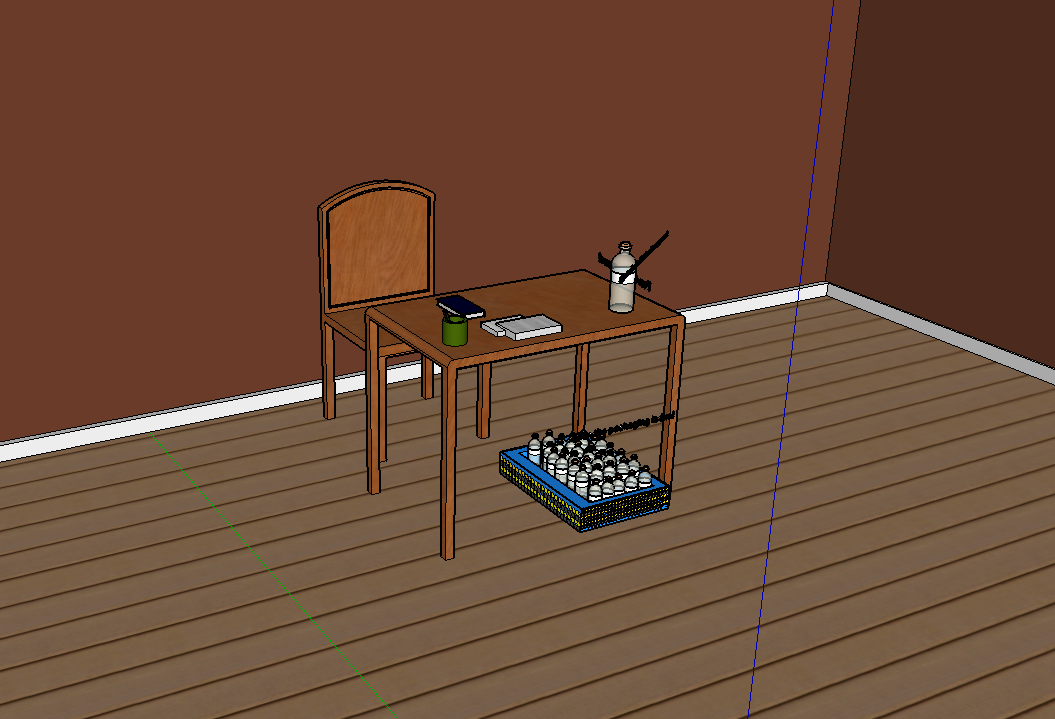
When I was in the animation strand I was in charge of creating the entire set. I was to give surroundings for our product that not only made sense, but were also aesthetically pleasing. I made a small desk for the product to be placed on and build up the room around it. The small things the trim on the floor made a huge difference in the overall feel of the room. I also added a cup with a couple pens, two stacks of paper, and a book. Colors made a huge difference. I wanted the room to be somewhat dull in order for the product and packaging would be the focal point.
When we were in the video strand, I was the lead actor and a consultant for storyline and framing. We developed the idea for how to have the friends appear and what to have me do. Our group knew we needed me to look shy on camera whenever I was without my friends, this is why I seem boring and somewhat emotionless when doing my interview. I was meant to look shy because I was without my friends.
This project forced us to work together in groups that we were not allowed to choose. This meant that we had to work together professionally and try to problem solve well. This meant our communication skills had to improve because otherwise things wouldn't get done within our group. I learned that it is better to avoid conflict within our group or try to find a solution for it quickly because otherwise group cohesion begins to fall away. Our group was not one for confrontation which meant our presentation ran more smoothly.
The scope of this project was to use all of the things we had learned previously in e9 to create and advertise a product. As a group random ideas were thrown out and eventually we settled on Friends in a Bottle. Then we began storyboarding our video and drawing rough logo ideas on paper. Once we had filmed our video we had a different idea of what we wanted our logo to be. After the animation was put together we decided what our product was all about. I began learning how to communicate better as we went and then we moved on to graphic design. Our logo was simple and beautiful. I learned that having others in a group to suggest things and look over your work helped to improve everything you do, especially when they are more critical.
Next time I would make the group communicate more and collaborate more to combine our ideas. We had trouble combining our ideas into one product, everything came out looking like we were making things individually. I would keep our group conversations about design and things the same, we chose fonts and designs as a group vote making it fair as well as consulting our instructor to make sure our designs and ideas worked well. Next time I hope to use better communication skills to make the group products look like they were made as a group. In the end it was an enjoyable project that built upon my skills as a student.
My commercial is advertising our product, Friends in a Bottle. This product is for people that lack friends or their friends are much too busy. When the customer receives the bottle they must open it and drink at least a sip. After the substance has had time to process what has happened 3 friends appear depending on what bottle has been purchased. In the commercial the bottle has a yellow strip signifying that the friends will be a mix of boys and girls that should be compatible with the customer's personality. The friends will then proceed to join the customer and do activities with the customer. Talking, playing games, and helping with homework are just a few functions that these friends can do. They are just like real friends but they are much more available and enjoyable. Fights are very uncommon as we have made sure that the friends will be as friendly and kind as possible.
This quarter of school, I went into the video strand of Olathe Northwest's e-Communications program. I learned many different things in this class that will help me to actively pursue a role in video, these things were the six shot system, the impact of audio or music in a video or short, and shortcut keys I can apply in editing. If you wish to find out more about those specifics please watch the above video. I also mention in this video that I learned things about how I communicate with others and how others communicate with me and talk about how I learned the most about social dynamics. I hope to use these newly acquired social skills in my everyday life and in all of my classes, not just in e-comm or school. I can't wait to begin creating more of my own videos for youtube and the world to see.
During this project I learned that I must record my shots for a longer amount of time in order to make them look better. I also learned that when you are in a group it is hard for everyone to agree on just one vision for a video. I will apply my editing skills and my framing to the video in order to continue to improve upon what I have already learned and applied to this video and the videos previous. The collaboration in this video was completely different because when there are 3 people and they are all creating one video it makes it harder to collaborate. For my next project I hope to get along a little better with my actors or peers because it will help me create a better video. This will allow for better overall shots and a much better overall video production and feeling.
While filming this project I learned that I must be creative with my shots and how I get them. I may need to use books to support my camera instead of the tripod because i want to be much lower to the ground in comparison to the height of the tripod. I also learned that when you tell your subject what to do you must be very clear about that you mean. For my next project I hope to add creativity and make my shots look much nicer than they do now. Our group did worked well together and collaborated, or cooperated, with each other extremely well. The group had a friendly air and allowed for both of us to be quite comfortable in our space. I believe if we worked together again I believe it would work out just as well as it did previously. Overall, I enjoyed this project and my group.